The Big Four

I probably have too many hobbies and one of them is that I have a model railway in my loft. Above the scenery I have a lot of space except on the north wall where the Velux windows are. To break up the big expanses I had the idea to add some posters of the train I have one for each of the railway regions that were formed in 1923 until 1947 known as the big four - LMS, LNER SR and GWR. I couldn’t find what I was looking for to buy and then I saw some very long thin canvases (100x 30cm) in Hobbycraft and decided to do my own posters based on the trains I run on my layout.

These trains were iconic in their time and were widely celebrated. They were also pretty quick even by todays standards and were the pride of the companies that owned them and the crews that operated them.

I started with the Coronation Scot and this is essentially copy of a painting by Norman Wilkinson, except I have used the maroon and gold version of the train as I have this a model of this loco and you saw the real thing at the National Rail Museum in York.

Coronation Scott at Shapps Summit

This took a very long time and much repainting to get right, never mind getting that fine gold lining and lettering to a good standard.

I then decided to tackle the Golden Arrow. Here I worked form photographs but again replaced the locomotive with one I have pulling this iconic train. The Pullman cars are still the height of luxury and you can still travel on special trains and experience what it was like to travel first class in the 1930’s.

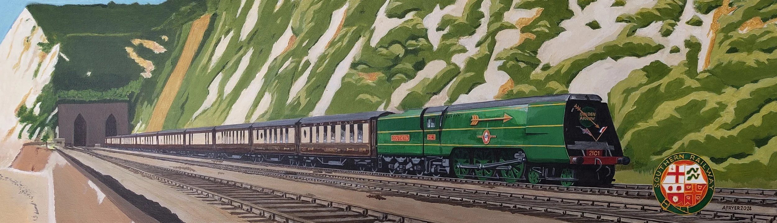
I have tried to use a similar composition, style and palette of colours to be consistent. Here the challenge was the exposed tracks and getting the perspective right for the unusual shape of this canvas.

Next up one of the most famous trains - Mallard, holder of the steam world record. I have shown her here pulling the coronation train designed for when George VI took the throne and it’s passing Alnwick, North of Newcastle.

The proportions need careful attention as many of my friends are railway enthusiasts and I did not want to disappoint them.

For my last painting I chose an older loco, the GWR City of London which would take passengers to Cornwall out of Paddington Station and pass over the iconic Brunel designed Royal Albert Bridge. Even in 1902 when this train was running this class could reach 100mph but GWR did not adopt the streamlined look for its locos like the other three railway companies so this does look more Edwardian than space aged. Locomotives like this also pulled ambulance trains that evacuated 1.2 million soldiers in World War One and that is the story I wanted to tell with this picture

The sea shall not have them

One of my neighbours has just celebrated his 100th birthday and I wanted to paint him something special. He served on RAF rescue launches in world war two fishing downed pilots out of the English Channel. However there aren’t too many pictures to work from - there was a Pathe news film about them and Airfix honoured them by making a kit of their boats.

I didn’t want my painting to look like the Airfix Artwork but I did like the angle Roy Cross used as it showed more of the superstructure which helped me get the proportions right. More importantly I didn’t want my work just to be a copy I wanted it brighter more 3 dimensional and set on the Sussex coast with details for the specific launch (190) that my neighbour served on.

I started with the sky just a simple combination of two blues with a few wisp[y clouds inspired by seascapes of the channel and then added in some stylised cliffs along the coast between Brighton and Eastbourne. Getting the sea right was done with greens on the surface of the waves facing towards me with the reverse slopes in more of a blue as they would reflect the sky.

Then the trouble started. I could not get the launch to look like it was cutting through the waves properly to give an impression of the 36 knots she could do. What helped here is that my neighbour had that Airfix kit and he asked me to make this up. the shape of the hull is not obvious but seeing it in 3d really helped ..

I also found my initial attempts at the superstructure were to flat - exactly what I was trying to avoid. Also these launches changed over time with more guns and shrapnel protection being added so getting the details right was hard as well.

Finally I even had trouble finishing up because I’d used some diluted acrylic washes and these moved when applied excellent Liquitex varnish I use so note to self next time dilute with acrylic thinners :-(

However I am pretty pleased with the results of three days effort, but I don’t see me applying for a job with Airfix to do their box art!

they sea shall not have them

and now I have completed the model less rigging..

Back to Basics

The great thing about teaching is that you learn so much when you do do that. My friend Roy asked how do you get the proportions right in a sketch and for me the easiest way to do that is to show by example. I got some objects that I have been given at work and arranged them as a still life with a strong primary light source so I could always go back to it and work on it..

You’d be amazed at what Microsoft puts its logo on!

You’d be amazed at what Microsoft puts its logo on!

I chose these carefully for their texture and shape including and in case you’re wondering the a 2kg green crystal (aka Kryptonite) at the back is what we get for 10 years at Microsoft!

So how to start drawing this?

Step one is composition - I won’t go into details but these were the things I thought about in arranging this:

  • you don’t want the crystal exactly in the middle of the picture,

  • I needed another object the mug to create some height to the left of the crystal

  • I wanted to see the writing on the t-shirt and make it look like a t-shirt without it being to neat and artificial

The next challenge is to capture the 3d composition on 2d paper. To do this find an exact eye position to do the drawing from and note how everything looks from this position so you can return to it. In this case I moved left and right until the left hand side of the letter O is is in line with the right side of my mug and the bottom of the crystal stand is just obscured by the top of the t-shirt the angle of this photo doesn’t quite show that but you get the idea.

Then I start measuring I worked out that from where I was sitting I could simply use the same dimensions to make the study on a sheet of A3 paper - for example in this picture from my position the crystal looks 12cm against my ruler held at arms length and I can use that same measurement on my drawing. It’s essential to do these measurement from the same position each time

measure.png

I draft the outline of the key shapes by measuring everything from a common point and cross check distances and angles to get a rough sketch with an HB pencil and not pressing too hard so these construction lines can be rubbed out as the work progresses.

To make this outline realistic the objects need to be filled in and my tips for shading would be:

  • Nearly close your eyes and look at the subject - you should be able to identify the brightest and darkest part of the the subject. This works because everything is out of focus and you can only see the most obvious patches of light and shade .

  • Work over each area with multiple grades of pencil. For deep shadows 9B is very dark but doesn’t fill the holes in the paper like a harder pencil so going over dark areas with a 2H makes them look darker.

  • Practice even shading and correct errors with a stump, putty rubber and more shading as needed

  • The flat surfaces of the crystal are not an even tone, typically they are darker nearer an edge and then get lighter.

note the darker shading denoting the edges of th ecrystal

note the darker shading denoting the edges of th ecrystal

Finally there is no substitute for practice, and I’d suggest if you are serious about drawing try and do a little every day.

My final sketch is below

swag lo res.jpg

It's that time of the year

I have built up a tradition of creating a piece of my work to serve as our Christmas card and these are often treasured and kept by my family and friends. I also give the original work as a present and this year my robin is going to be gift for our dance teacher Teddie if we ever get out of lockdown. She tries really hard to get this clumsy old fool to foxtrot as well as I paint, and I know she misses her pupils as the Covid crisis only seems to deepen, so I’ll try and drop it round when I am allowed to..

I have painted a Robin before but ruined it when trying to improve the background. This version was inspired by our resident robin who delights in watching us working on the garden from the comfort of one of our apple trees. The background is just a subtle transition of blues and then I used ever darker colours to create the impression of depth with the branches. I always try and use more colour than there is and I like to work from my own images, in fact I specifically take photographs to draw from.

Robin 2020.JPG

Alzheimer's Society

I am trying to work out how to apply my skill with a paintbrush and pencil to supporting the Alzheimer’s Society but why?

AS_Logo_Main_Pos_In_aid_of_CMYK_Eng.jpg

Dementia devastates lives. Currently there are over 850,000 people living with dementia but by 2021 1 million people will be living with the condition. But dementia won’t win. Until the day we find a cure, Alzheimer’s Society will be here for anyone affected by dementia – wherever they are, whatever they’re going through.  ​

Alzheimer’s Society is the leading care and research charity offering expert information, training, and support services to all those who need our help. And we are creating a more dementia friendly society so people with the condition can live without fear and prejudice.

Alzheimer’s Society’s mission is to transform the landscape of dementia forever. We want everyone affected by dementia to know that, whatever they are going through wherever they are, whoever they are, they can turn to Alzheimer’s Society for support, help and advice. Until we find a cure, we will strive to create a society where those affected by dementia are supported, accepted and able to live in their community without fear or prejudice.

Each penny raised from this site will help us to support all those affected by  dementia, and their carers.

So if you like my work please click on the just giving button and make a small donation:

If you are one of the few who have some of my work already (you know who you are) then I would really encourage you to support this charity with what you feel is appropriate.

Finally if like my work I maybe able to do something for you - I can’t make promises as this is just a hobby and my art does come form the heart, then I would insist on a donation . If that’s you please e-mail me and we can discuss what you’d like

Safari

I got an outstanding achievement award for my work back in 2015 which resulted in an organised weeks holiday for my wife and I to Cape Town along with 300 or so other Microsoft colleagues from across Europe and the Middle East. Part of this was a day trip to a safari park and we got some great shots:

Deadlier than the male.JPG

A couple of years later my sister went to Kruger National Park and so I thought I would do a series of pictures for her to remind her of her trip as I had painted Wolf for my brother. I decided to use my normal watercolour pencils but this time on coloured paper designed for pastels, with a different natural shade for each one. The light reflected off the soil and the soil in their coats made the animals seem almost pink so I consciously used the same pencils in each drawing and only made minimal use of raw black and white to make them as colourful as possible. I am especially pleased with the Zebra and although the rhinoceros took the longest he’s the one I am still not happy with. However showing these to friends it seems everyone has their own view

20200903_182344.jpg

The finished works are under the animals section.

Finally thanks to Rob F, the best manager I have ever had for going well beyond the day job, and giving my the opportunity to do these for my smarter sister

Wolf

Wolf was my brother’s favourite dog and they were both commended at the highest level for their work together in the Police. So I wanted to a really good study of this amazing dog, that really captured him. If you’ve looked at other pages on here my work tends towards detailed illustration, but for this I wanted something looser and more emotive.

Wolf is no longer here but over the years our family have taken lots of photos but in most of these his tongue is out as it’s a dogs radiator when they are warm and Chris and Wolf are always training. His family all commented on his lovely eyes so I thought a face portrait rather than all of him would be best. I had thought about a representational background but reverted to an abstract sombre greys to bring out the eyes and as a cue that he is no longer with us.

I used several techniques to create more expression in this work - Bigger brushes, not wearing my glasses all the time, and I usually had a beer on the go for each session! Like all artists I made mistakes doing this and I had to restart it from scratch after the background went wrong. As you can see below I started out picking out the main shadows with Payne’s grey and the highlights with a cream colour, both straight from the tube with a big hog brush for this

20200527_192222.jpg

I am also trying to encourage my friend Roy to paint more and we both have a socially distancing beer in my outdoor studio while I explain what I am doing. I promised Roy I’d only work on it when he was here so he could see the whole process and I think this helped me to continually revaluate my work by starting each session with a careful examination of what needed improving as I wanted to encourage him to be critical of his own work rather than me making suggestions and also to show that art is essentially learning through these mistakes.

My brother has now taken delivery of the finished Wolf:

WOLF.JPG

Code Breakers

In the engineering group I work in we have formed into for Dev Crews Lever, Rock Briggs and Clarke

Read More

Drawing from life

I have to confess to having a model railway in my loft and I thought it might be interesting to capture one my locomotives as a drawing. I set this sill life up and photographed it in case it got distrubed.

As you can see at the bottom of the picture I then proceed to sketch the outline onto tracing paper not the actual paper I’d use for the actual drawing as |I like to keep that really clean and free of mistakes at least that was the plan as I am not the tidiest worker!

Soft pencils smudge really really easily, so being left handed I start on the right and have my lighting coming from the right so my hand does not cast a shadow where I am working

I am a leftie

I am a leftie

Another thing to note above is to move the drawing around especially when working on curves to get your hand at the centre of the circle or curve you are trying to draw.

On of the many challenges in drawing man made things is the gradual change of tone over an essentially flat areas like the sides of the locomotive. So I tried and shaded with even pressure flatten that with a stump and then re work usually with a harder pencil to even things out even more. On the subject of changing pencils it’s a bit like painting with numbers where I try and use the same grade of pencil for the same things like those side panels:

9 shades of grey pencil

9 shades of grey pencil

Other tips I would share are:

  • Take a break every half an hour

  • regularly stand back and look at the whole piece for overall tone and that the relative tones of highlights and shadows compare well to the original

  • Hold your work up to a mirror, or get someone else to critique as you go. My wife is good at spotting mistakes so I try and encourage her to give me constructive feedback and show her I am fixing it.

After 24 or so hours of work here the finished article:

20200330_165346.jpg

Notes on my black & white Vulture drawing

I was inspired to go back to basics with simple set of pencils by work we have of NZ artist Geoff Williams like this one. I am never going to be that good but as I get towards retirement I am able to focus on my skills again like this sketch of a white vulture.

20200110_101641.jpg

I did this from a series of picture of this magnificent bird at the Hawk Conservancy Centre in Andover.

You don’t need a big budget to draw and it isn’t that messy

Materials

  • Derwent Graphic pencils from H to 9B plus

  • a set of stumps from ebay for blending and smudging

  • putty rubber

  • chamois leather

  • drawn on A4 Daler Rowney Fine grain Heavyweight paper

Some Tips

Never touch the paper directly - always have you hand resting on a sheet of paper or even tape something to the side of your wrist & little finger as grease on paper is your enemy to achieving a crisp result. As a Leftie I started on the right of the drawing and systematically worked leftward to avoid any contact with the heavy areas of shading to keep them crisp.

I sketched out what I wanted the vulture to look like on ordinary paper only when I was happy with it did I transfer that outline to the paper I would used form my drawing via some tracing paper. a couple of things to note here.

  • Tracing is not necessarily cheating, old masters would work on separate materials and create cartoons of their work and then prick through that material to create an impression on the canvas they were working from.

  • to get as much contrast as possible on the finished drawing you don’t want a lot of working out lines on the finished paper it’s nearly impossible to get back to pristine white paper once it has a line on it whatever eraser you use.

The details of the lines and hairs around the vulture’s face was sheer hard work. I kept my pencils really sharp and took great care to keep the highlights clean. I kept referring back to my reference material both for proportion and to get the comparative tone levels just right. For proportion an unusual trick is to look at your drawing in a mirror, step away from it and while you can work at A4 on a flat surface you need an easel for anything larger. For tone levels you can only make things darker but so only go in with the big guns like a 9F towards the end as that stuff smudges really easily and can make surrounding areas very muddy

I created the background by sanding my 9B pencil onto a clean chamois and rubbing it into the paper, and then lighting some of that with by pouncing it with the putter rubber to create a random but uniform background. When I go close to creating the background around the vulture I switched to using a clean stump and carefully work around the top of his heard to create the illusion of the light feathers against a dark background.

I hope that helps