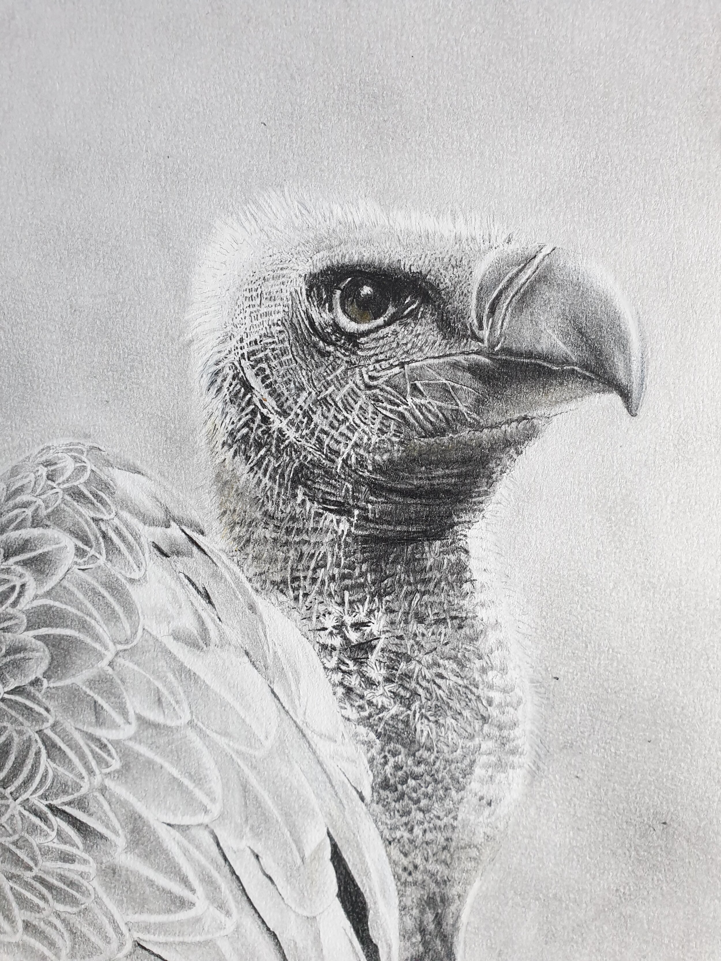
I was inspired to go back to basics with simple set of pencils by work we have of NZ artist Geoff Williams like this one. I am never going to be that good but as I get towards retirement I am able to focus on my skills again like this sketch of a white vulture.
I did this from a series of picture of this magnificent bird at the Hawk Conservancy Centre in Andover.
You don’t need a big budget to draw and it isn’t that messy
Materials
Derwent Graphic pencils from H to 9B plus
a set of stumps from ebay for blending and smudging
putty rubber
chamois leather
drawn on A4 Daler Rowney Fine grain Heavyweight paper
Some Tips
Never touch the paper directly - always have you hand resting on a sheet of paper or even tape something to the side of your wrist & little finger as grease on paper is your enemy to achieving a crisp result. As a Leftie I started on the right of the drawing and systematically worked leftward to avoid any contact with the heavy areas of shading to keep them crisp.
I sketched out what I wanted the vulture to look like on ordinary paper only when I was happy with it did I transfer that outline to the paper I would used form my drawing via some tracing paper. a couple of things to note here.
Tracing is not necessarily cheating, old masters would work on separate materials and create cartoons of their work and then prick through that material to create an impression on the canvas they were working from.
to get as much contrast as possible on the finished drawing you don’t want a lot of working out lines on the finished paper it’s nearly impossible to get back to pristine white paper once it has a line on it whatever eraser you use.
The details of the lines and hairs around the vulture’s face was sheer hard work. I kept my pencils really sharp and took great care to keep the highlights clean. I kept referring back to my reference material both for proportion and to get the comparative tone levels just right. For proportion an unusual trick is to look at your drawing in a mirror, step away from it and while you can work at A4 on a flat surface you need an easel for anything larger. For tone levels you can only make things darker but so only go in with the big guns like a 9F towards the end as that stuff smudges really easily and can make surrounding areas very muddy
I created the background by sanding my 9B pencil onto a clean chamois and rubbing it into the paper, and then lighting some of that with by pouncing it with the putter rubber to create a random but uniform background. When I go close to creating the background around the vulture I switched to using a clean stump and carefully work around the top of his heard to create the illusion of the light feathers against a dark background.
I hope that helps